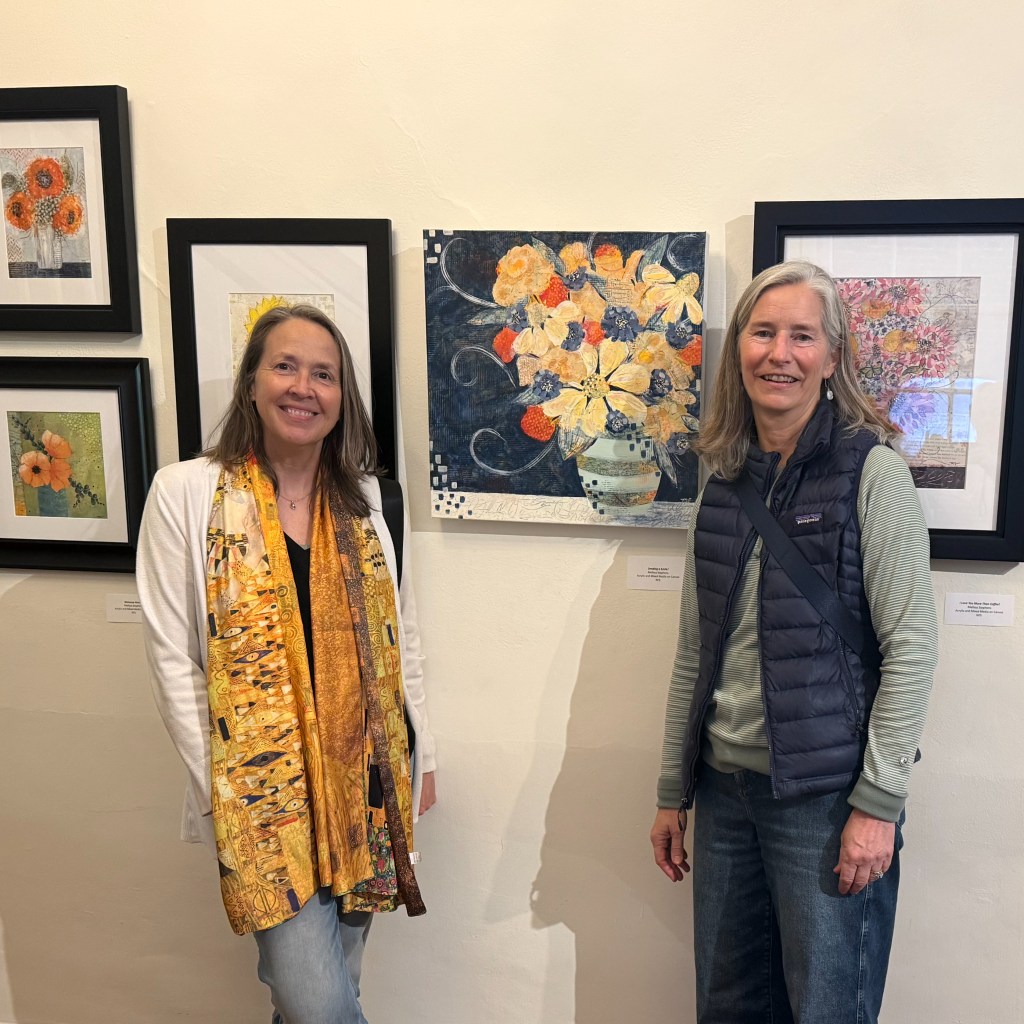
Huge thanks to family and friends, near and far, who traveled to Centre County to see the 9 paintings I had hanging in the Bellefonte Art Museum during the month of March 2026. I was able to accompany many of you to see the show and, for someone who paints alone in her 2nd floor bedroom-turned art studio, it has been a lovely opportunity to talk about my art!
The last time I displayed artwork, almost 3 years ago, at The University Wine Company, I wrote short descriptions of my process or inspiration for every painting and displayed those beside each piece. Visitors to the gallery loved reading those stories! Unfortunately, for this museum show, I was only able to submit succinct label information (title/medium) to hang with the work. Also, neither the title of the show nor the overall theme, which could be found on the museum’s website, were hanging with my art. Without those, I’m not convinced a throughline for all 9 pieces was inherently obvious. I was asked several times, “what ties the pieces together?” and “how did you choose your titles?” For that reason, I’m sharing all 9 pieces in this post along with a brief story about each one. The overall theme for the collection was “The Flower Shop” as all the works are floral bouquets, which I imagined arriving, with a delightful burst of color and a cheerful message (the painting’s title), at your doorstep during the wintry month of March. Here’s the explanation I wrote for the website:
“In the depths of winter, I finally learned that within me there lay an invincible summer” Albert Camus
As winter continues to hold us captive in its chilly grasp, I welcome you to “The Flower Shop,” where florals delight your senses despite the frigid temperatures and blustery winds outside. My studio is my greenhouse, a nurturing environment in which I cultivate a perennial garden of saturated color, immersing myself in flowers all year long. Using acrylic paint, found collage papers, ink and charcoal, I gather my blooms into vibrant mixed media bouquets. Titled with messages of inspiration, well-wishes, and comfort, each piece, delivered as if by magic from The Flower Shop, conveys a story of hope and promise, of invincible summer.
The other common denominator among all 9 pieces is my use of collage paper within the work: maps, old journals, music, children’s books, printed tissue paper, old sewing patterns, etc. In every painting, within the blooms, leaves, vases, tabletops, or backgrounds, collage paper appears, adding words or notes, numbers or images to the florals. This is the visual interest I adore! For me there is no greater compliment than when someone lingers, looks closely at my work, and exclaims, “Oh, look at that!”
Part of a series, this painting is a meditation on the word “beauty.” In creating it, I challenged myself to start with a new process for me at the time, completely covering the background in a variety of collage papers. Airier flowers were then painted on top to allow as much of those papers to show through in the final piece as possible. Throughout the process, I embraced the ideas of beauty as unexpected (a floral painting without the traditional use of green) and different (an exhortation to celebrate our own unique individuality as beautiful). “Beauty is different,” is written over and over into the work, can you spot it?
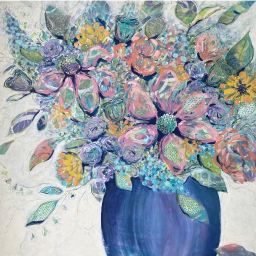
This painting behaved like a challenging 2-year-old, positively refusing to cooperate! My goodness, there are probably 12 versions of this painting under the one you see here. The worse it got the bolder my brushstrokes became, I had nothing to lose! Those white swirly marks were a last-ditch effort, made almost carelessly with a dry, scruffy, Japanese brush, just before I planned to sneak the contemptuous canvas out to the rubbish bin. I stepped back after I painted those marks and thought, “huh, you might grow into a painting after all?” A few more tweaks and finally, I pronounced her done!
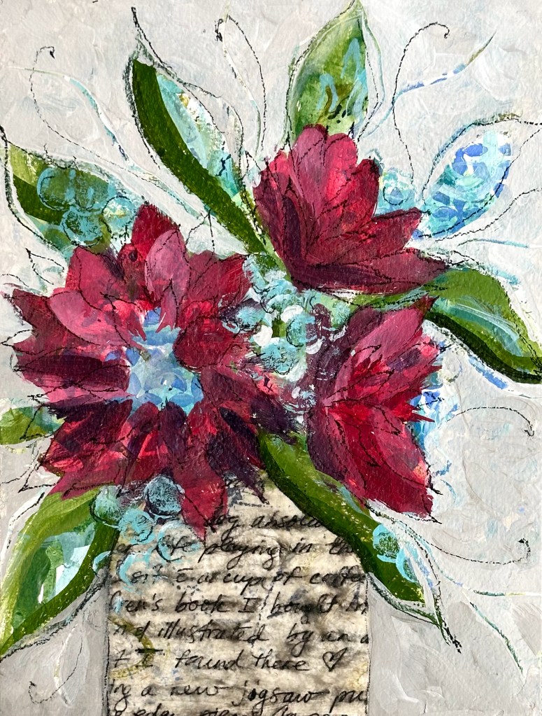
For close to 30 years, I’ve kept a gratitude journal. The practice of writing 5 things at the end of each day for which I am thankful has been life changing, especially when our 3 children were small. Recently, I decided to tear apart a few of those old journals to use as collage paper for my art. One of those pages serves as the vase in this piece. I love the way the glue (Golden’s Matte Medium) slightly blurs the ink of my handwriting. Yet I can still read, on that day, I was thankful for: our dog, playing, a cup of coffee, a children’s book, and a new jigsaw puzzle. In the simplicity of those ordinary, celebrated moments, all these years later, I still recognize myself. For that I am grateful.
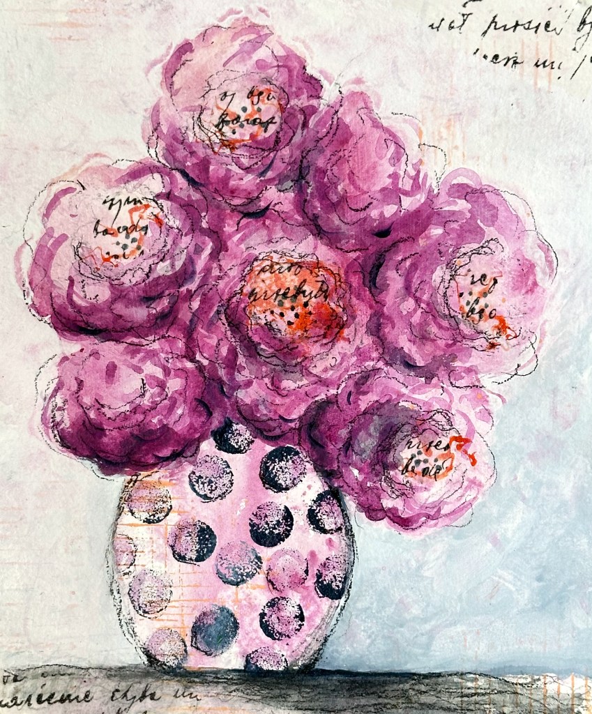
This painting, along with “Missing You” and “Hello Sunshine” (the next 2 listed) were created using a limited palette of 3 primary colors: Golden’s Quinacridone Magenta (a cool red), Hansa Yellow (a cool yellow), and Payne’s Gray (a gray/blue) plus white (gesso). I love the range of colors and the color harmony I can create from only 3 primaries. It’s an easy and powerful limitation I often use in my work. Combined with script lettering printed on tissue paper and polka dots, this piece makes me smile!
One of the 1st layers of this painting included the beautiful, watery drips of Payne’s Gray paint. When I stepped back I thought, “that looks like a vase.” I then set about to create the rest of the painting around that happy accident. This piece felt a bit somber when grouped with my other bouquet’s, thus it boasts the only title in the show tinged with sad yearning.
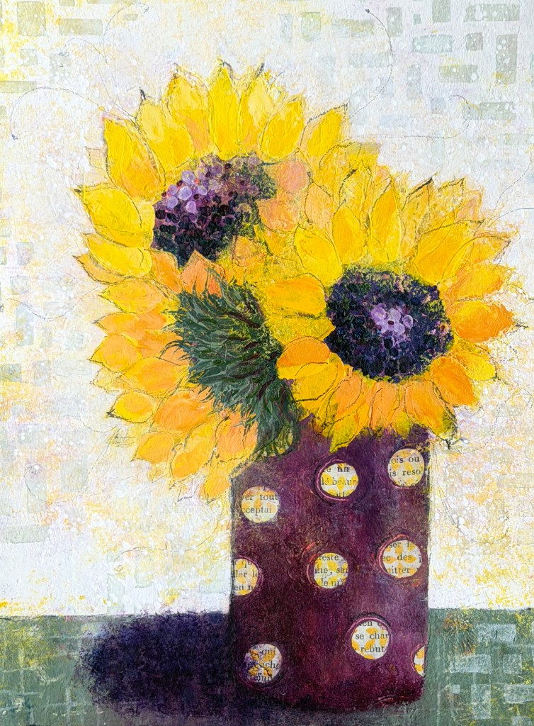
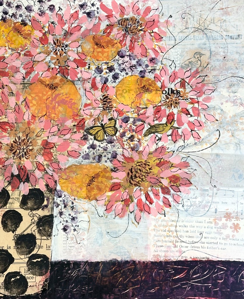
French book paper from the Paris Flea Market was stamped and then cut into circles for the vase for these 3 sunflowers. Oh, how I adore circles and sunflowers! Win – win!
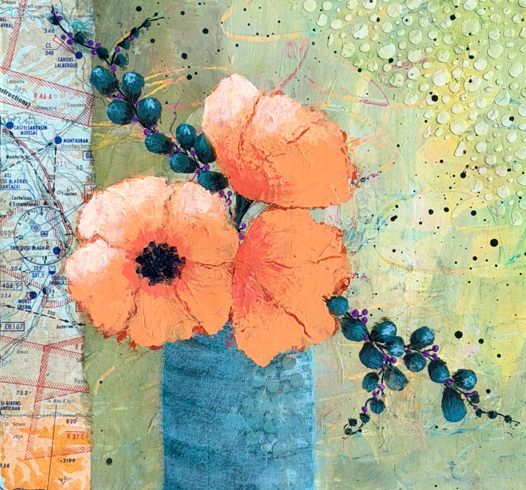
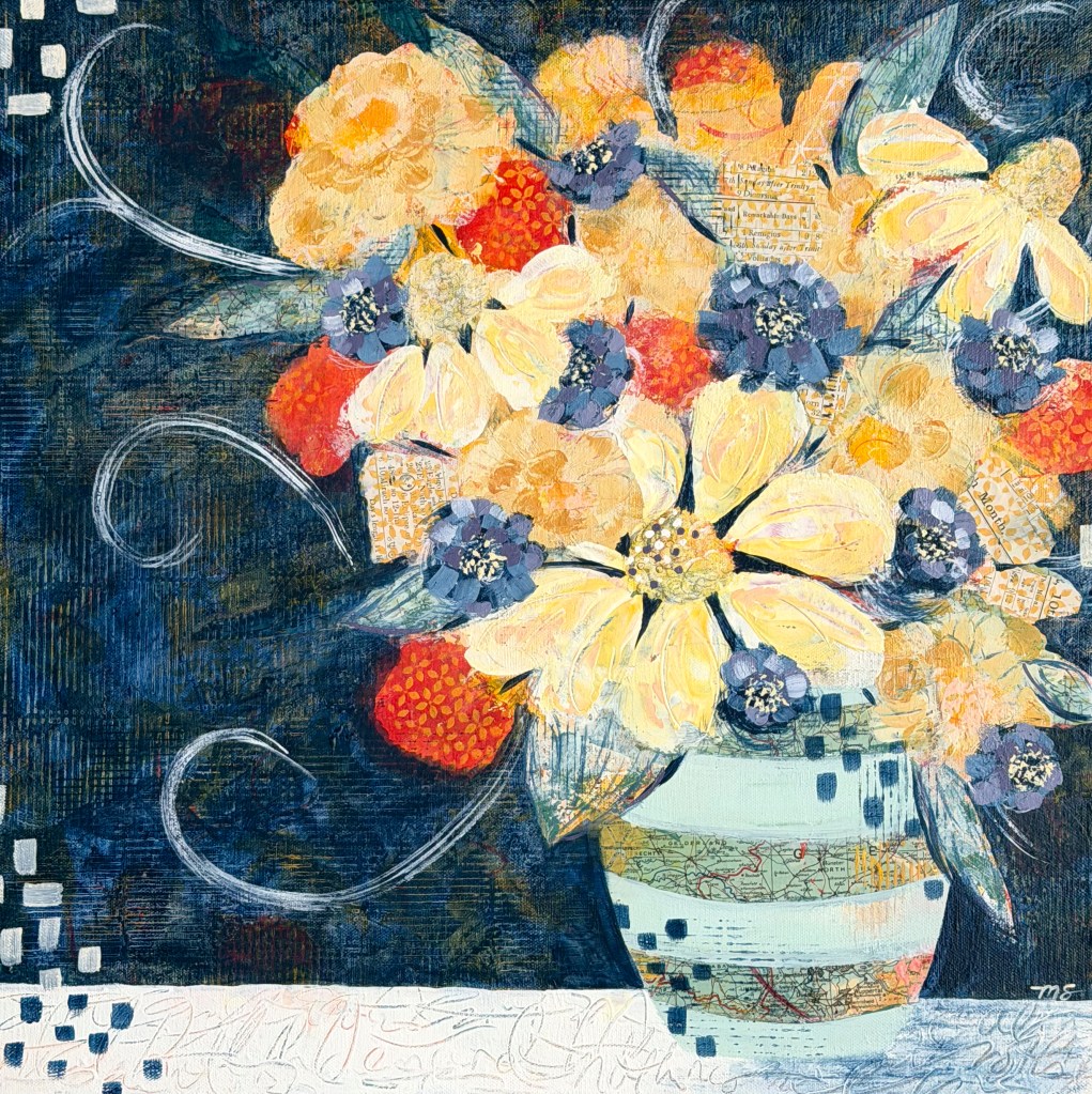
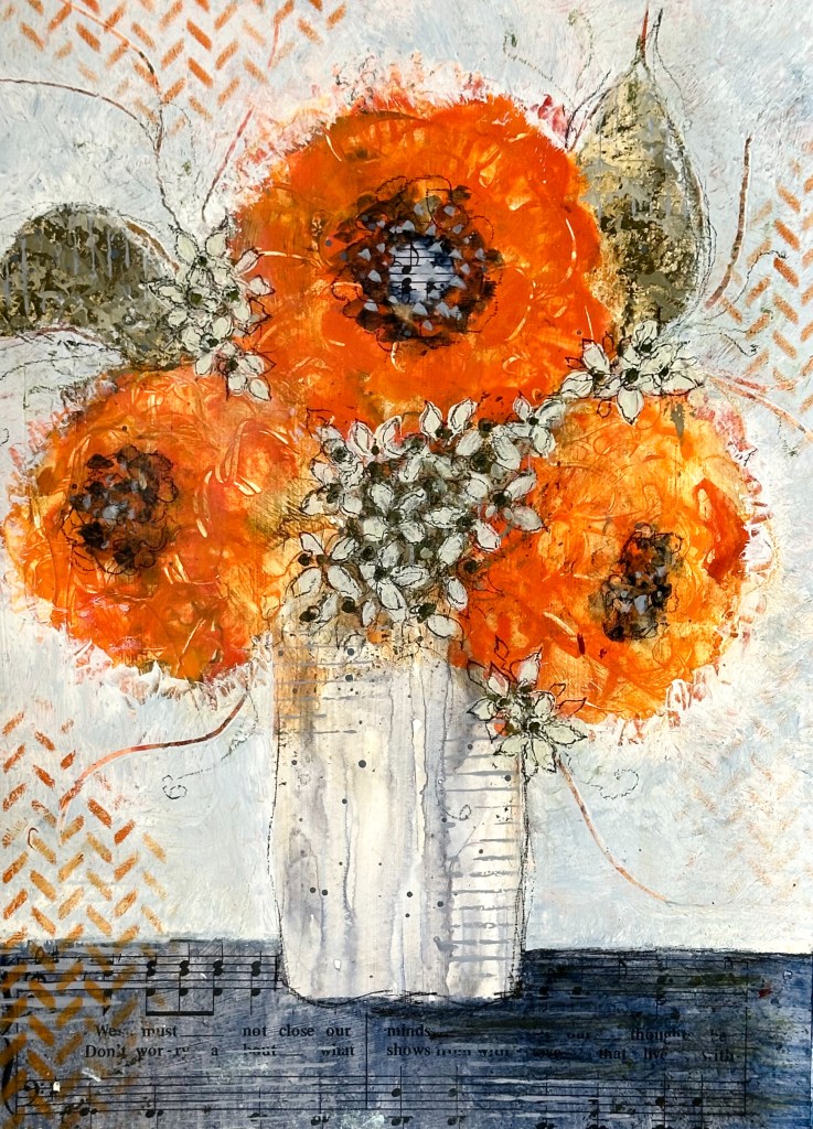
January 2026’s post (“Be Where Your Feet Are”) refers to this painting. The map, adhered to the lefthand edge, was purchased from the Paris flea market. I believe this is my favorite painting of this group of 9: I love the colors; I loved the process (far more important, always, than the result); and, most importantly, I love the risks I took along the way (painting and repainting the orange flowers, sanding and repainting the vase, and adding the details onto the branches). A lot went into these 64 square inches!
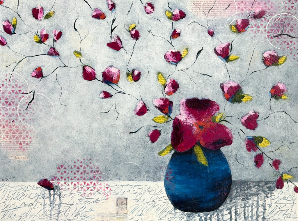
This is another painting I’ve discussed in depth (February 2026’s post, “Two Roads.”) Based on the stamp set honoring the poet Robert Frost and his famous poem which includes the lines, “Two roads diverged in the wood and I took the one less traveled by,” I created these two budding branches to symbolize the choices we make in our lives.
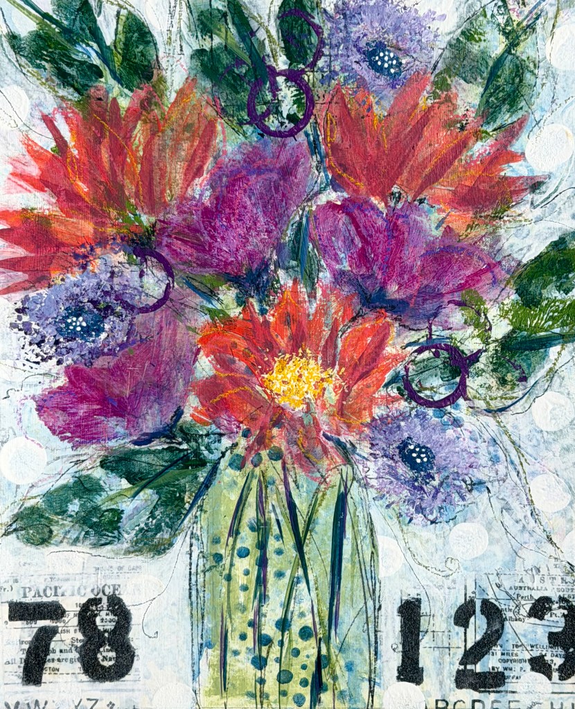
My original intention was to hang a different piece as my 9th work, and I started it with great energy and excitement. It was moving nicely toward the finish line when, late in the process and with great despair, I realized I’d “killed” it. That’s painting talk for “sucked every bit of life out of it.” I tucked it away in a dark recess of my closet and chose, instead, to show this study (a play piece never intended to be a finished painting) which I created during an online course last fall. From a “Surprise Jar” filled with 30 or so painting prompts, I chose 1 prompt at a time (6 total) and constructed the entire painting quickly and with great joy. The result felt full of energy; it captured the emotion I hope to convey every time I open a tube of paint. Though far from “polished,” I’m much happier with the feeling of this happy little study than the “real painting” I perfected to death (and then hid in the closet!)

Leave a comment